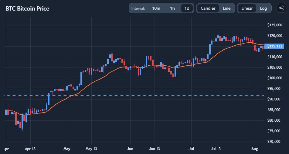
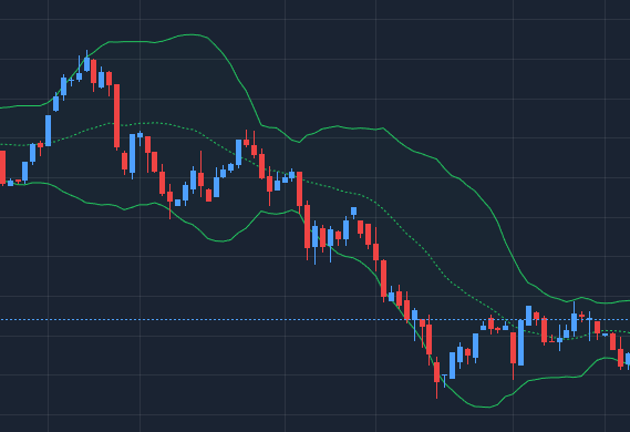
Interpretation
What problem this visualization solves
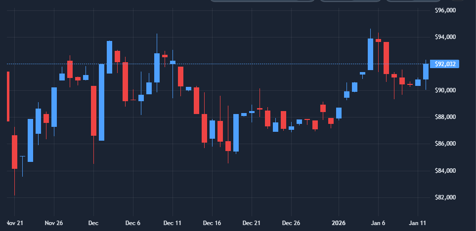
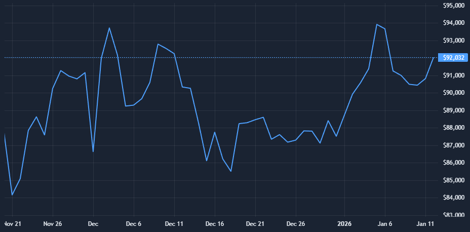
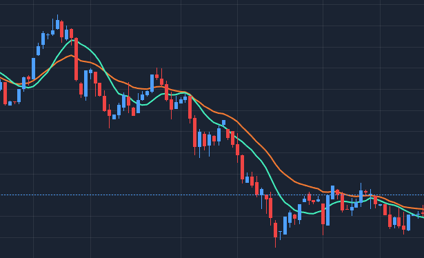
Raw price charts show what happened, but not how or why price moved the way it did.
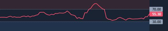
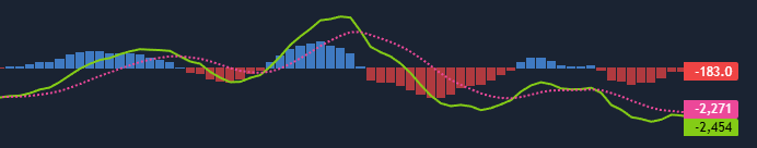
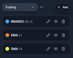
Technical analysis tools help you:
- identify trend direction and trend changes
- gauge momentum and exhaustion
- understand volatility expansion and contraction
- put price moves into structural context
This chart brings the most commonly used TA views into a single, fast exploration workflow.
What you’re looking at

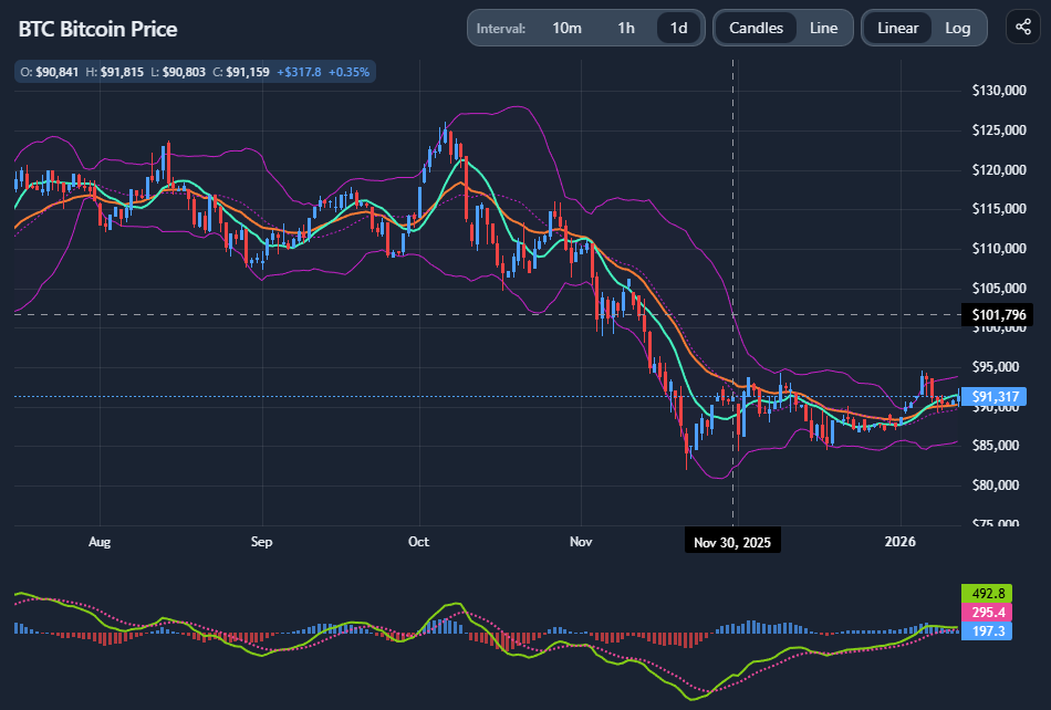
The chart shows the price evolution of a selected crypto asset over time, with optional overlays and indicators that transform price into signals.
At its core:
- price is shown as either candlesticks or a line
- time progresses left to right
- indicators derive information from price, not from fundamentals or flows
Technical indicators do not predict the future — they reframe past price action to make patterns easier to see.
Candles vs line (structure vs simplicity)
Candlestick charts
Candles show:
- open, high, low, close
- intraperiod volatility
- rejection and follow-through
They are useful when:
- analyzing short- to medium-term structure
- identifying wicks, ranges, and breakouts
- assessing volatility within a timeframe

Line charts
Line charts:
- use closing prices only
- remove intraperiod noise
They are useful when:
- focusing on broader trends
- comparing structure across long timeframes
- avoiding over-interpretation of noise+

Linear vs logarithmic scale (this matters a lot)
Linear scale
- Equal vertical distance = equal absolute price change
- Emphasizes recent price action
- Can distort long-term comparisons
Best for:
- short-term analysis
- range-bound markets
- assets with limited price history
Logarithmic scale
- Equal vertical distance = equal percentage change
- Preserves proportional moves across cycles
Best for:
- long-term charts
- assets with large historical growth (e.g. BTC, ETH)
- identifying structural trends across regimes
Many misreads in crypto come from using linear scales on long-term charts.
How to interpret common indicators
Moving averages (SMA, EMA)
Moving averages smooth price to reveal trend direction.
- Simple Moving Average (SMA) treats all periods equally
- Exponential Moving Average (EMA) reacts faster to recent price changes
They are often used to:
- identify trend direction
- spot potential trend shifts
- act as dynamic support or resistance
They work best in trending markets, and poorly in choppy ones.

Bollinger Bands
Bollinger Bands measure volatility, not direction.
- Band expansion signals increasing volatility
- Band contraction signals compression
- Price touching bands does not automatically mean reversal
They are most useful for:
- spotting volatility regimes
- identifying expansion after compression
- avoiding false calm in low-volatility phases

Momentum indicators (RSI, MACD)
Relative Strength Index (RSI) highlights momentum and relative strength:
- Overbought/oversold are contextual, not signals by themselves
- Divergences matter more than levels

Moving Average Convergence Divergence (MACD) focuses on trend momentum and shifts:
- Crossovers show momentum changes
- Distance from zero shows trend strength

Momentum indicators are confirmations, not triggers.
Common misinterpretations (important)
- Indicators do not work equally in all regimes
Trend indicators fail in ranges; oscillators fail in trends. - More indicators ≠ better analysis
Stacking correlated indicators adds confidence illusion, not insight. - Signals without context are meaningless
Timeframe, scale, and volatility regime matter more than settings. - TA does not explain fundamentals or flows
It only describes price behavior.
When this chart is most useful
- Studying trend structure across timeframes
- Identifying momentum shifts after large moves
- Comparing linear vs log perspectives
- Exploring volatility expansion and compression
- Quickly sanity-checking price narratives
When not to rely on it
- For fundamental valuation
- For illiquid or manipulated markets
- For precise timing without broader context
- As a standalone decision system
Key takeaways
- Technical indicators reframe price, they don’t predict it
- Scale choice can completely change interpretation
- Context matters more than indicator settings
- TA works best as a lens, not a rulebook
How to use
Basic chart controls
You can:
- switch between candles and line
- toggle linear and logarithmic scales
- change time intervals to zoom in or out
- pan and inspect specific periods

Changing timeframe and scale should be part of the analysis, not an afterthought.
Adding and managing indicators
You can add common indicators such as:
- SMA
- EMA
- Bollinger Bands
- RSI
- MACD

For each indicator:
- parameters can be adjusted
- visibility can be toggled
- indicators can be changed or removed

Keep setups minimal — clarity beats complexity.
Organizing indicator setups
Indicator configurations can be:
- saved, adjusted and freely named
- reused across analyses
- shown or hidden to compare perspectives
- you can define your default indicator set to be loaded initially

This makes it easy to:
- test different interpretations
- switch between “trend view” and “momentum view”
- avoid rebuilding setups repeatedly
Example workflow
A simple exploratory flow:
- Start on a higher timeframe with log scale
- Identify the primary trend with moving averages
- Switch to a lower timeframe for structure
- Add RSI or MACD to assess momentum shifts
- Check Bollinger Bands to understand volatility context
This keeps analysis structured and avoids indicator overload.
