Interpretation
What problem this visualization solves
Comparing crypto assets by price alone is misleading.
Bitcoin at $90,000 and Ethereum at $3,000 tells you nothing about which asset performed better, how much risk was taken, or when leadership changed. Percentage returns are harder to track visually across assets, especially over longer periods.
Indexed Performance Comparison removes price-level bias so relative performance can be evaluated directly.
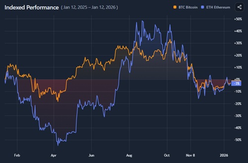
What you’re looking at
Each selected asset is converted into an index that starts at 100 on the chosen start date.
- The vertical axis represents percentage change relative to the start
- A value above 100 means the asset is up since the start date
- A value below 100 means it is down
Because all assets share the same starting point, their performance paths can be compared directly.
How the index is constructed
For each asset:
- The price on the selected start date is set to 100
How to use
Controls and options
You can use the Indexed Performance Comparison tool to:
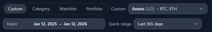
- Select up to three assets to compare
- Adjust the start and end dates
- Change the time window to study different market regimes
- Share the chart state for discussion or documentation
Changing the start date can significantly alter the interpretation, so it should be chosen intentionally.
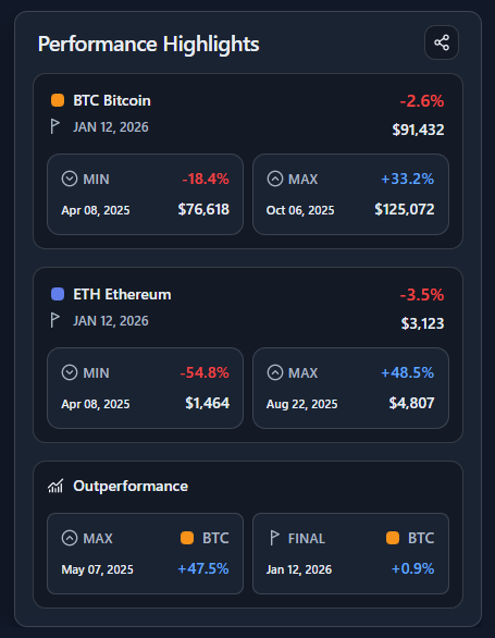
Performance Highlights panel
The Performance Highlights panel summarizes key outcomes numerically:
- Final performance
Where each asset ended relative to the starting index - Minimum and maximum
- Deepest drawdown (with date and price)
- Maximum gain achieved during the period
- Outperformance
- The largest performance spread between assets
- Which asset finished ahead at the end date
This panel answers:
“Who won, how painful was the journey, and when did it matter most?”