Interpretation
What problem this visualization solves
Crypto returns are extremely concentrated.
A large part of a year’s performance often comes from a small number of extreme days, while the rest of the year contributes little or even detracts. Traditional price charts hide this concentration and make returns appear smoother than they actually are.
This visualization makes return concentration explicit.
What you’re looking at
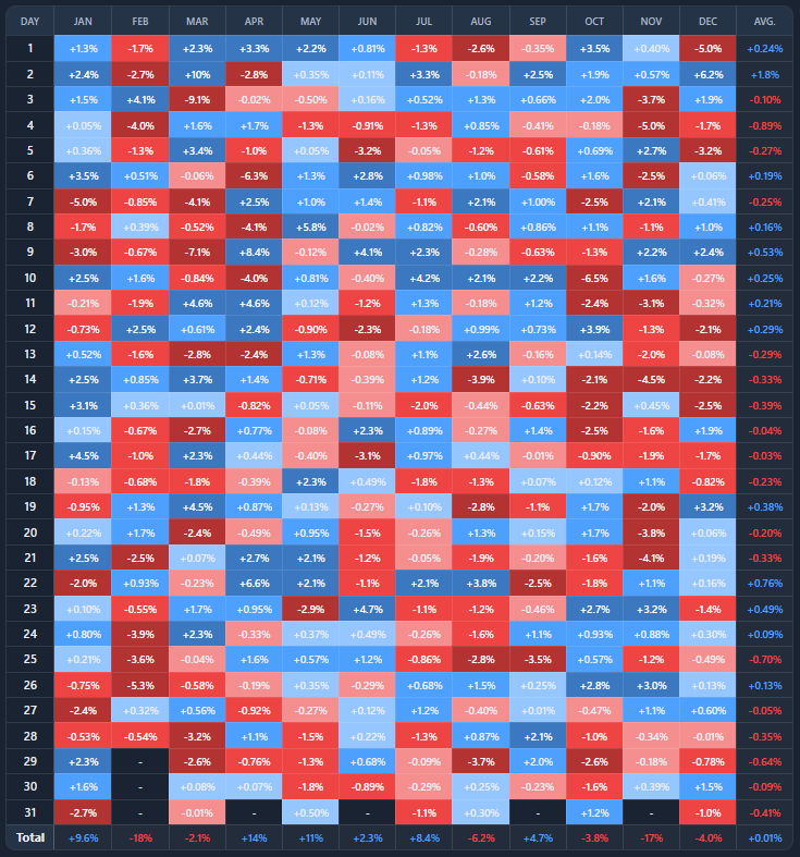
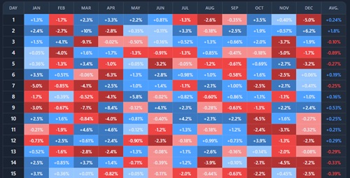
You are looking at a calendar-style heatmap of daily returns for a selected asset and year.
- Rows represent the day of the month
- Columns represent months
- Each cell shows that day’s return
- Color intensity reflects magnitude (positive or negative)
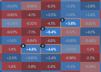
On top of the heatmap, the tool highlights the best or worst X days and shows how much they contributed to the year’s total return.
How returns concentrate
Yearly returns are the sum of many uneven daily moves.
- Most days contribute little
- A few extreme days dominate outcomes
- Missing those days can drastically change performance
This chart helps answer:
“Did this year’s return depend on a handful of days, or was it broadly distributed?”
Best days vs worst days
Highlighting the best X days shows:
- how much upside came from rare spikes
- how sensitive returns are to timing
- how costly it can be to be out of the market
In crypto, the best days often occur during periods of high volatility — sometimes near market stress.
Highlighting the worst X days shows:
- downside concentration
- where drawdowns were formed
- how much damage a few days caused
Avoiding just a handful of bad days can materially improve outcomes — in hindsight.
“Only held” vs “missed” scenarios
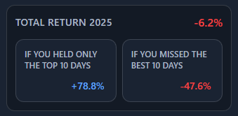
The Contribution breakdown compares three paths:
- Full year return
What actually happened - Only held highlighted days
Performance if you were invested only on those days - Missed highlighted days
Performance if you were invested except on those days
These are counterfactuals, not strategies — they illustrate sensitivity, not tradable rules.
Why we show geometric and log returns
You’ll see two return decompositions: geometric returns and log returns.
They describe the same price path from different perspectives.
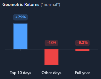
Geometric returns (“normal”)
- reflect real-world compounding
- match what a portfolio actually experiences
- cannot be added cleanly across periods
- are asymmetric (−50% requires +100% to recover)
Use these to answer:
“What would my actual return have been?”
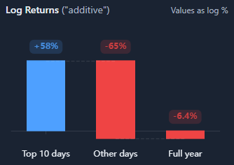
Log returns (“additive”)
- transform returns so they can be added across time
- treat gains and losses symmetrically
- make contribution analysis cleaner and more intuitive
- are commonly used in risk and academic analysis
Use these to answer:
“How much did each group of days contribute to the total move?”
Why both matter
- geometric returns show real outcomes
- log returns show structural contribution
- large differences signal volatility drag and concentration
If geometric returns show a strong loss but log returns decompose cleanly, the difference is volatility — not arithmetic error.
(Learn more about geometric vs log returns)
Common misinterpretations
This does not imply you can predict best or worst days
The analysis is retrospective.
Avoiding bad days also means risking missing good days
They often cluster together.
High concentration does not mean a broken market
It is a structural feature of volatile assets.
The value is in understanding fragility, not designing perfect timing strategies.
When to use and when not to use
Most useful for
- studying timing risk in crypto
- understanding volatility clustering
- comparing different years or assets
- explaining why “buy and hold” feels emotionally hard
- stress-testing assumptions about market exposure
Not suitable for
- short-term trading signals
- predictive strategies
- analysis without broader market context
Key takeaways
- A small number of days often drive yearly returns
- Missing those days can flip outcomes entirely
- Volatility concentrates both risk and opportunity
- Timing matters more than intuition suggests
How to use
Selecting asset and year
Choose an asset and a specific calendar year to analyze daily returns in a calendar heatmap. You can switch between assets (and portfolios, if available) to compare how different markets behaved in the same year.
Each year tells a different story — results are highly regime-dependent.
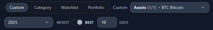
Highlighting best or worst days
Use the controls to:
- toggle between best and worst days
- choose how many days to highlight (top/bottom X)
Highlighted cells are emphasized in the heatmap and used in the return decomposition.
Reading the heatmap
- Darker colors indicate larger moves
- Clusters reveal periods of elevated volatility
- Isolated extremes often reflect one-off shocks or news-driven moves
A simple way to scan:
- vertical scanning helps compare monthly behavior
- horizontal scanning helps spot day-of-month effects
Contribution breakdown panel
The Contribution panel summarizes:
- total return for the year
- return from only holding the highlighted days
- return if you missed the highlighted days
- averages, plus the best and worst day of the year
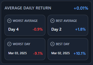
This makes concentration visible without manual calculation.
Example workflow
- Select BTC and a volatile year
- Highlight the best 10 days and observe how much of the year’s return they explain
- Switch to worst days and compare downside concentration
- Compare the asymmetry between upside and downside contributions
This quickly reveals whether performance was fragile (few days dominated) or broadly distributed across the year.