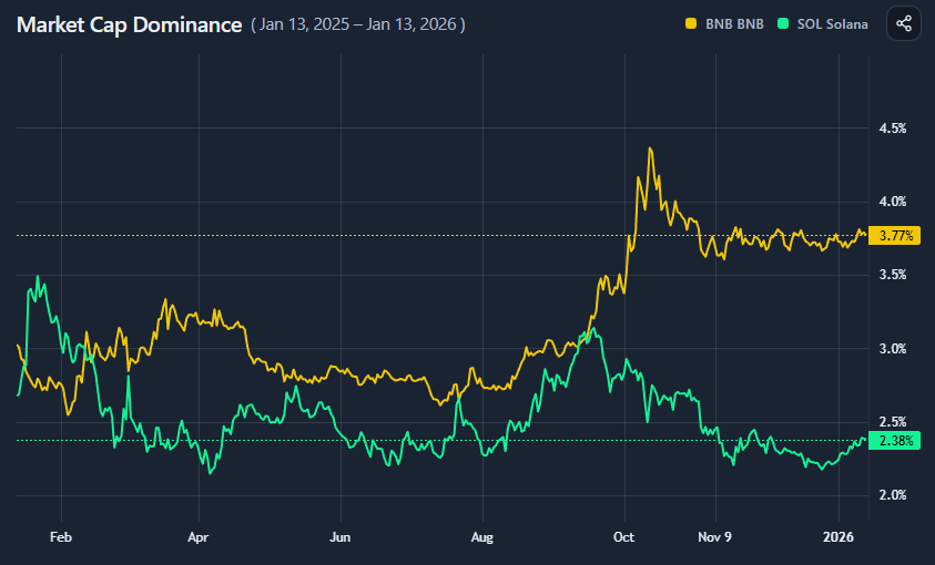
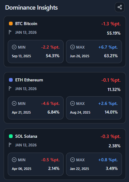
BlockViz
GuidesMarket CapMarket Cap Dominance

Market Cap Dominance

Track an asset’s market share vs total crypto — or vs your own basket.

Open tool →

Interpretation

What problem this visualization solves

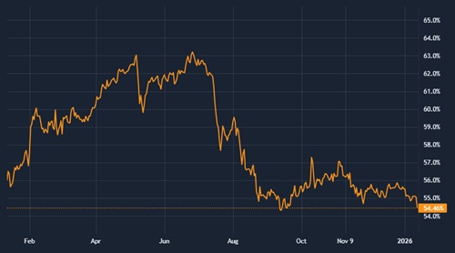
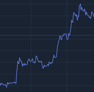
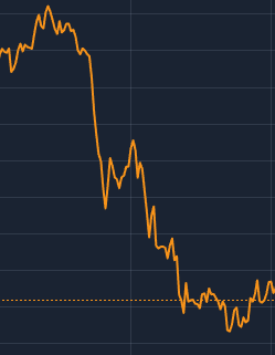
Price performance alone does not tell you whether an asset is gaining or losing relevance within the market.
Market cap dominance answers a different question:
“How much of a given market does this asset command over time?”

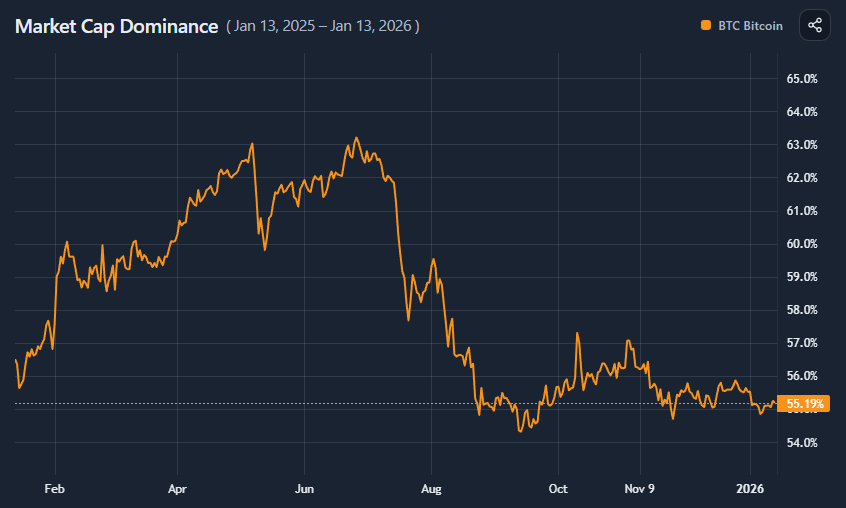
This visualization helps separate:

  • absolute growth from relative strength
  • market-wide expansion from rotation
  • temporary rallies from structural leadership shifts

What dominance actually measures

Market cap dominance is an asset’s market share relative to a chosen reference market.

At any point in time:

  • dominance increases if the asset grows faster than its reference
  • dominance decreases if it underperforms its reference
  • flat dominance means it is moving broadly in line with the reference

Dominance focuses on share, not price.

Reference frames matter (a lot)

Dominance is always calculated relative to something.
Changing the reference frame changes the question you are asking.

Total market cap

  • answers: “Is this asset gaining or losing share of the entire crypto market?”
  • best for macro leadership and cycle analysis

Category-based dominance

  • answers: “Is this asset leading within its sector?”
  • useful for rotation analysis (e.g. L1s, memecoins, DeFi)

Custom baskets (watchlist / portfolio)

  • answers: “Is this asset outperforming my chosen universe?”
  • useful for relative allocation and internal benchmarking

The same asset can lose dominance in the total market while gaining dominance within a category.

Rising dominance

  • relative outperformance
  • capital concentrating into the asset
  • often signals leadership or defensive preference

Falling dominance

  • relative underperformance
  • capital rotating elsewhere
  • may occur even if price is rising

Sideways dominance

  • asset is broadly tracking its reference market

Dominance trends often move slower than price, making them useful for regime-level analysis.

Comparing two assets

When plotting two assets together:

  • you are comparing relative share trajectories
  • crossovers indicate shifts in leadership
  • divergence highlights rotation dynamics

This is especially useful within:

  • categories
  • portfolios
  • thematic baskets

Common misinterpretations

Dominance does not equal price performance
An asset can rise in price while losing dominance.

Falling dominance does not mean failure
It may reflect faster growth elsewhere.

Dominance is not a short-term trading signal
It describes structural positioning, not timing.

When to use and when not to use

Most useful for

  • tracking leadership across cycles
  • studying rotation between sectors
  • evaluating relative strength within a basket
  • understanding capital concentration

Not suitable for

  • short-term price prediction
  • isolated event analysis
  • assets with extremely small or unstable market caps

Key takeaways

  • Dominance measures market share, not price
  • The reference frame defines the insight
  • Relative strength often changes before narratives do
  • Custom baskets unlock deeper comparative analysis

How to use

Selecting assets and reference frame

You can plot dominance for up to three assets at a time.

Choose a reference frame via the Asset Picker:

  • Total market cap (default)
  • Category (e.g. L1s, Memecoins)
  • Watchlist
  • Portfolio

Dominance is recalculated dynamically based on the selected reference.

Category, watchlist, and portfolio modes

Category mode

  • dominance is calculated against the total market cap of that category
  • useful for identifying internal leaders (e.g. DOGE within Memecoins)

Watchlist / Portfolio mode

  • dominance is calculated against the combined market cap of your selected assets
  • useful for benchmarking assets within a custom universe

These modes let you define your own comparison baseline.

Reading the chart

  • values represent percentage share of the reference market
  • rising lines indicate growing share
  • falling lines indicate declining share

Comparing two assets highlights relative leadership within the same reference frame.

Insights panel

The Insights panel summarizes:

  • current dominance
  • minimum and maximum share (with dates)
  • net change over the selected period

This helps quantify trends without manual inspection.

Example workflow

  1. Start with total market dominance for a major asset
  2. Switch to category mode to see sector leadership
  3. Compare up to three assets within the same reference
  4. Change the time range to observe regime shifts
  5. Use insights to contextualize price performance
Market Cap Dominance preview

Try it yourself

Market Cap Dominance

Use the interactive tool to explore the same concept with your own time range and settings.