Switching between the two reveals structure that a single view would hide.
Remainder: focusing on what matters without clutter
When comparing market cap development across many assets, showing every component individually can quickly overwhelm the chart.
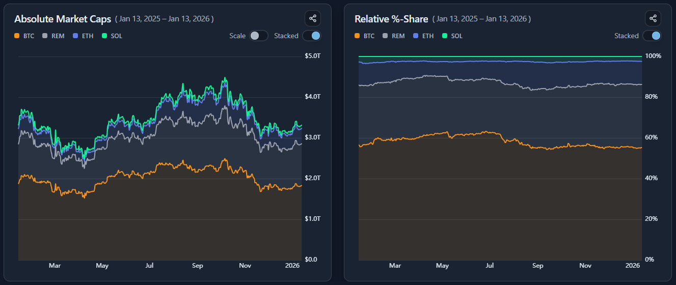
To keep comparisons readable, BlockViz uses a Remainder series.
Remainder represents the combined market cap of all assets in the reference basket that are not explicitly selected.
This allows you to:
focus on a small set of assets
preserve full context against the chosen basket
avoid visual clutter from dozens of minor components
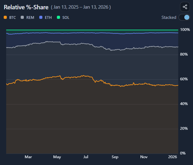
In stacked views, Remainder completes the total basket. In relative share views, it shows how much of the basket is not captured by the selected assets.
Importantly, Remainder is not a residual error or approximation — it is a deliberate aggregation of the remaining assets.
This makes it easier to answer questions like:
“How dominant are the assets I care about?”
“Is growth coming from my selections, or from the rest of the market?”
“Am I tracking leaders, or just a small slice of a much larger move?”
Remainder keeps the chart honest while staying interpretable.
Reading rotation and leadership
Use the two charts together:
rising absolute caps + rising share → leadership
rising absolute caps + falling share → underperformance within a strong basket
Absolute and relative views answer different questions
Growth and leadership are not the same thing
Stacked and line views reveal different structure
Context matters more than raw size
How to use
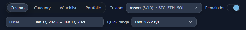
Selecting assets and basket
Select multiple assets and define the comparison basket using:
total market
a category
a watchlist
a portfolio
Decide on whether to show the remainder of the visualized assets vs. the chosen reference frame or only focus on those assets. Both charts update to reflect the chosen universe.
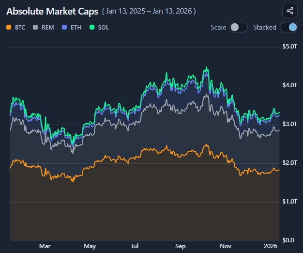
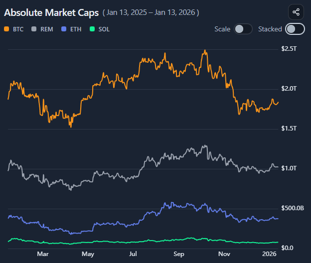
Understanding the two charts
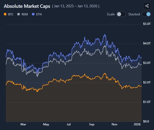
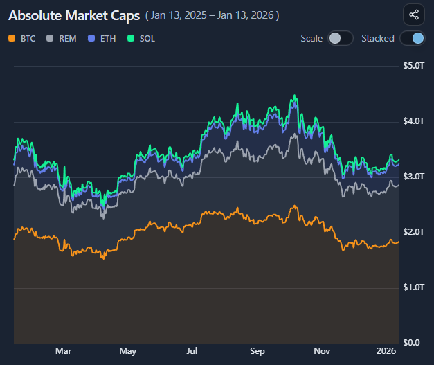
the left chart shows absolute market caps over time
the right chart shows relative % share of the basket
Use them together to separate total growth from internal rotation.
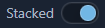
Using stacked and line modes
Toggle between:
stacked mode to view aggregate composition
line mode to compare individual trajectories
Stacked views emphasize structure; line views emphasize comparison.
Using autoscale
Enable autoscaling to remove the forced zero baseline.
This:
zooms into smaller changes
makes relative movements clearer
is especially useful when assets differ greatly in size
Autoscaling changes the visual framing, not the data itself.
Example workflow
Select a category or custom basket
Start in stacked view to understand overall growth