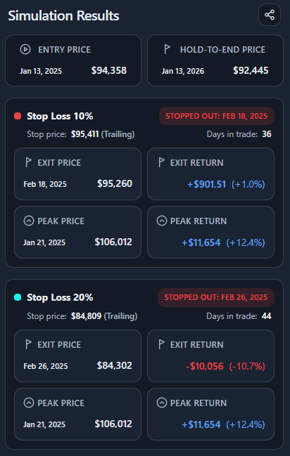
Interpretation
What problem this simulation solves
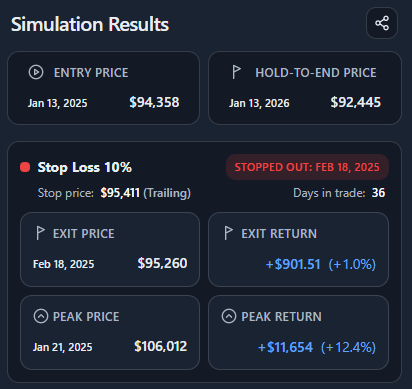
Stop losses feel protective in theory, but in volatile markets they often raise a painful question:
“Would I have been stopped out anyway?”
This simulator answers that question explicitly and visually, using real price paths instead of intuition. It shows if, when, and at what price a fixed or trailing stop would have exited your position.
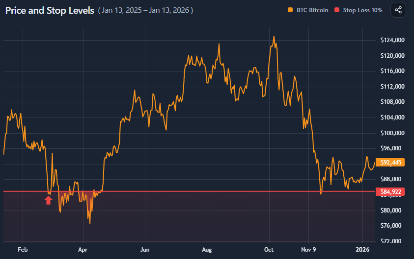
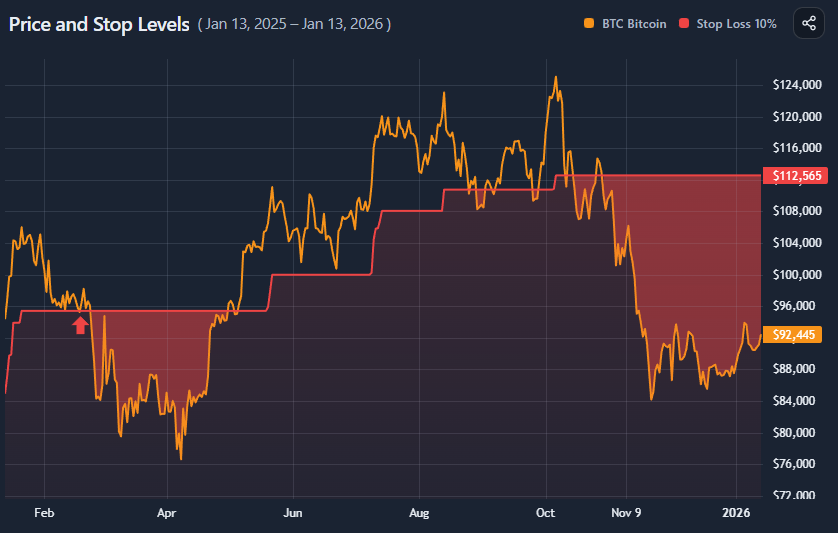
What you’re looking at

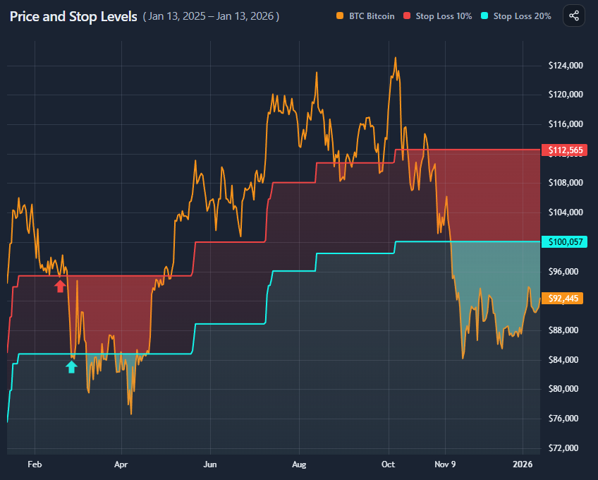
The chart overlays stop logic directly on price:
- Price line shows the asset’s actual price path
- Stop level line(s) show where your stop(s) would have been
- Shaded area marks regions where price fell below the stop
→ meaning you would no longer be in the trade - Arrow marker shows the first stop-out event
You can compare one or two stop losses simultaneously.
Fixed vs trailing stops (conceptually)

Fixed stop loss
- Defined as a fixed percentage below entry
- Never moves up
- Protects against large drawdowns
- Often vulnerable to early volatility

Trailing stop loss
- Moves up as price makes new highs
- Locks in gains
- Can exit profitable trades early during pullbacks
Neither is “better” universally — they encode different risk tolerances.
Why two stop losses matter
Markets are noisy.
Using two stops lets you compare:
- A tight stop (discipline, low tolerance)
- A wide stop (patience, volatility tolerance)
This highlights whether you were stopped out due to:
- Poor timing
- Normal volatility
- Or genuinely adverse price structure
Reading the results panel

The summary separates three outcomes:
- Entry price
Where the trade started - Exit price (stop)
Where you were taken out - Range end price
Where price finished if you had held regardless
Each stop card additionally shows:
- Stop-out date
- Days in trade
- Return at exit
- Peak price and peak return before exit
This makes opportunity cost measurable, not emotional.
What this does not imply
This tool does not claim:
- That stops are good or bad
- That wider stops are superior
- That holding is always better
It also does not model:
- Re-entry
- Dynamic stop adjustment
- Fees, slippage, or execution latency
It is a diagnostic, not a trading system.
Key takeaways
- Many stops fail due to volatility, not trend failure
- Tight stops reduce drawdowns but increase exit frequency
- Trailing stops trade upside capture for participation
- Seeing stop-outs visually changes risk intuition
- Stop placement defines behavior, not correctness
How to use
Selecting asset and date range

Choose:
- An asset
- A date range (or quick range)
The simulation always assumes:
- Entry at the start of the selected range
- One continuous position
Configuring stop losses

You can configure:
- Stop Loss 1
- Optional Stop Loss 2
For each stop:
- Set percentage distance
- Choose Fixed or Trailing
Both stops are applied independently and visualized together if enabled.
Reading the chart overlay
- When price stays above the stop, the trade remains active
- When price crosses below the stop, the shaded region begins
- The arrow marks the first stop-out moment
If two stops are active:
- You can visually compare which one fails first — or survives entirely
Comparing stop outcomes

Use the results panel to compare:
- Exit timing
- Exit return
- Peak unrealized return before exit
- Final outcome vs holding
This helps answer:
- “Was I stopped out too early?”
- “Did the stop protect me from worse?”
- “How much upside did I give up?”
Example workflow
A simple diagnostic flow:
- Select BTC and a volatile year
- Set a tight fixed stop (e.g. 10%)
- Add a wider trailing stop (e.g. 20%)
- Observe stop-out timing
- Compare exits vs end-of-range price
This quickly reveals whether your stop logic fits the asset’s volatility profile.
