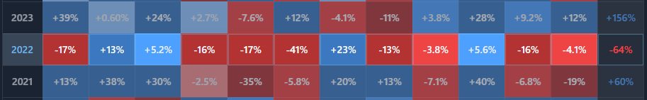
BlockViz
GuidesPriceSeasonality Heatmap

Seasonality Heatmap

Spot seasonal patterns — averages by month/quarter, drill down by year.

Open tool →

Interpretation

What problem this visualization solves

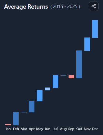
Seasonality claims are common in crypto — “May is weak”, “Q4 is bullish”, “September always dumps” — but they are rarely tested across multiple years.

This visualization helps separate:

  • recurring patterns
  • one-off events
  • narrative-driven hindsight

By showing returns by month or quarter across years, it makes it easier to see whether seasonality is persistent or anecdotal.

What you’re looking at

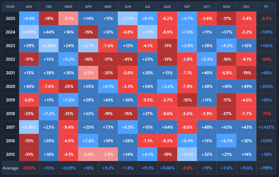
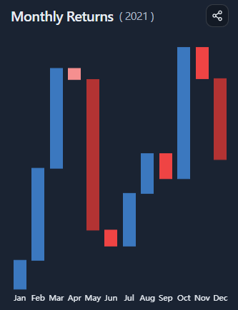
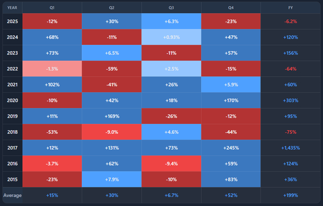
You are looking at a multi-year heatmap of returns, grouped by month or quarter.

  • Each row represents a year
  • Each column represents a month (or quarter)
  • Each cell shows the return for that period
  • Color intensity reflects magnitude (positive or negative)

A side panel summarizes either:

  • average returns across all years, or
  • the return path of a selected year

How to read seasonality patterns

Seasonality is about tendencies, not guarantees.

When reading the heatmap:

  • consistent color patterns across many rows suggest recurring behavior
  • mixed colors indicate weak or unreliable seasonality
  • isolated extremes usually reflect event-driven years

Strong seasonality requires both frequency and consistency.

Averages vs individual years

By default, the side panel shows average returns per month or quarter across the selected year range.

This answers:

“On average, how does this asset behave in each period?”

Selecting a specific year switches the panel to that year’s return path, revealing:

  • how closely it followed (or broke) historical patterns
  • which months drove that year’s outcome
  • whether “seasonal strength” actually mattered in practice

Comparing averages to individual years helps avoid overgeneralization.

Monthly vs quarterly views

Monthly view

  • higher resolution
  • more noise
  • better for spotting specific months with recurring behavior

Quarterly view

  • smoother
  • fewer data points
  • better for identifying regime-level patterns

Switching between them helps test whether a pattern survives aggregation.

Common misinterpretations

Seasonality is not a trading signal
Patterns can disappear as regimes change.

A strong average can hide weak consistency
A few extreme years can distort averages.

Past seasonality does not imply future certainty
Especially in fast-evolving markets like crypto.

Seasonality is best used as context, not conviction.

When to use and when not to use

Most useful for

  • evaluating seasonality narratives
  • comparing behavior across market cycles
  • sanity-checking “this month is usually bullish/bearish” claims
  • contextualizing short-term performance

Not suitable for

  • short-term timing decisions
  • predicting single-month outcomes
  • use without broader market context

Key takeaways

  • Seasonality describes tendencies, not rules
  • Averages must be compared against individual years
  • Consistency matters more than magnitude
  • Patterns weaken or disappear across regimes

How to use

Selecting asset and period granularity

Choose an asset and toggle between monthly or quarterly aggregation.

The heatmap automatically updates to reflect the selected granularity across all available years.

Reading the heatmap

  • Blue cells indicate positive returns
  • Red cells indicate negative returns
  • Darker colors signal larger magnitude

Scan vertically to compare years, and horizontally to compare periods.

Using the average returns panel

By default, the side panel shows:

  • average return per month or quarter
  • best and worst periods
  • average yearly return

This view summarizes long-term tendencies across the selected year range.

Drilling down into a specific year

Click any year in the heatmap to:

  • highlight that row
  • switch the side panel to that year’s return path
  • view best and worst periods for that year
  • see the total return for the year

This makes it easy to compare narrative averages with actual outcomes.

Example workflow

  1. Start in monthly view and scan for recurring patterns
  2. Check the average returns panel for confirmation
  3. Click individual years to see how often the pattern held
  4. Switch to quarterly view to test robustness
  5. Use the results as context, not prediction
Seasonality Heatmap preview

Try it yourself

Seasonality Heatmap

Use the interactive tool to explore the same concept with your own time range and settings.

Seasonality Heatmap – BlockViz