Interpretation
What problem this visualization solves
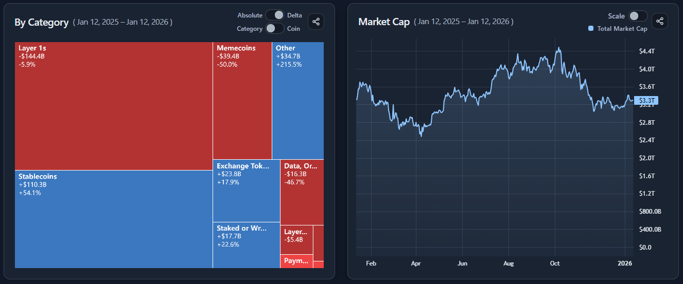
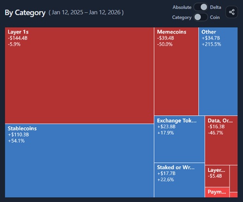
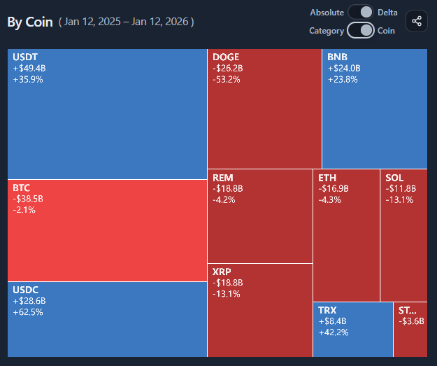
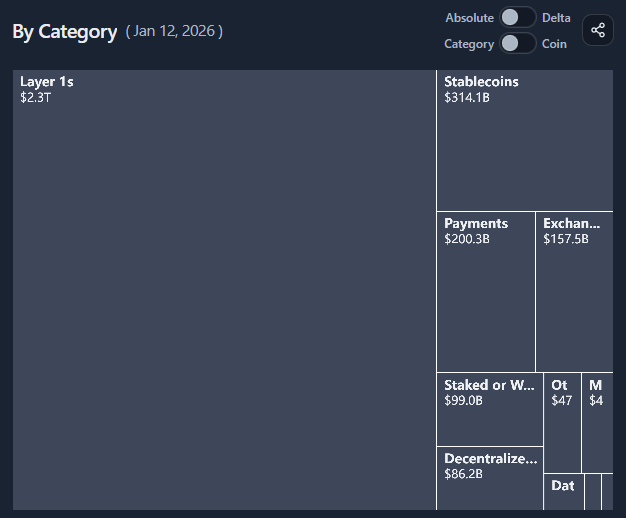
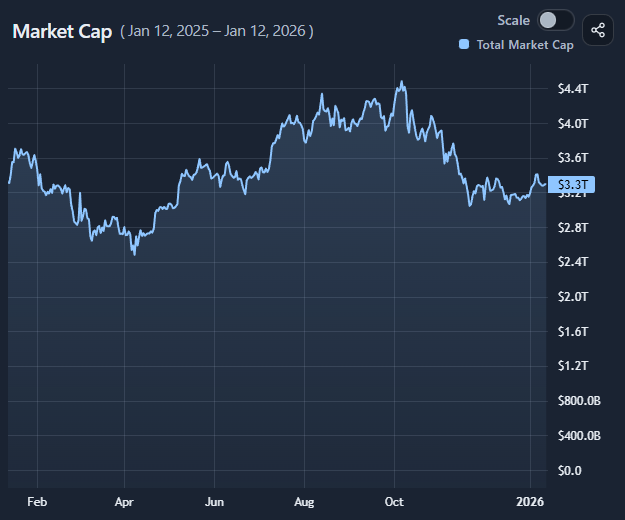
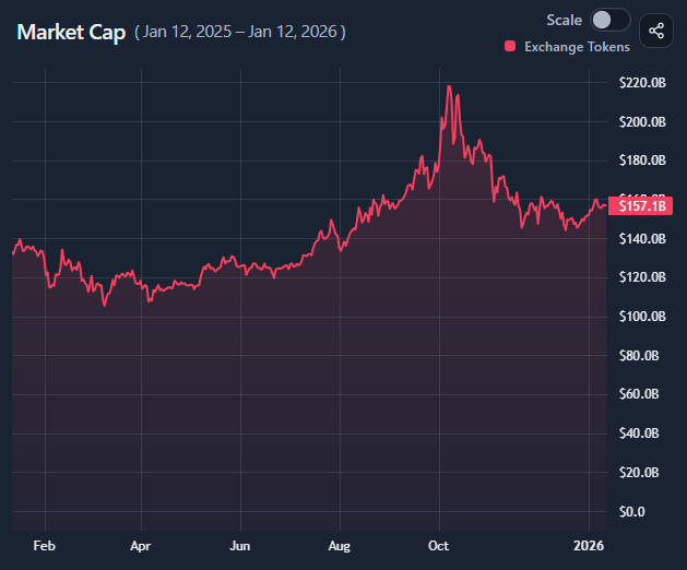
Market structure is hard to grasp from tables or line charts alone.
This visualization answers:
- who matters most right now (structure)
- who is driving change (flows)
- how today’s snapshot fits into a trend (development)
By combining a treemap with a linked time-series chart, it connects market composition with market evolution.
What you’re looking at