
Interpretation
What problem this visualization solves
Market cap comparisons are often framed as naive statements like
“If ETH had BTC’s market cap, ETH would be $X.”
That framing hides two problems:
- Assets already have some share of each other’s market cap
- Market caps change over time, so forcing a fixed percentage can distort history
This simulator makes parity comparisons explicit, continuous, and time-aware.
What you’re looking at
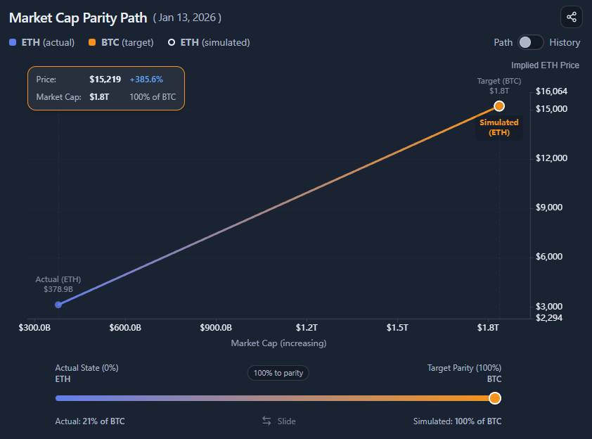
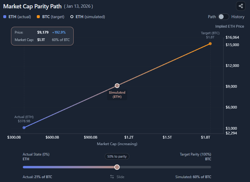
You are looking at a market cap parity simulation between two assets:
- Asset A (the one being simulated)
- Asset B (the reference / target)
The chart shows:
- The actual price of Asset A (optional)
- The simulated price of Asset A if it moved along a path toward Asset B’s market cap
- A slider that controls how far along that path Asset A moves
The results panel translates that simulated market cap into an implied price.
Understanding “path to parity” (important)
The slider does not directly represent
“X% of the target market cap.”
It represents
X% of the path from the current state to full parity.
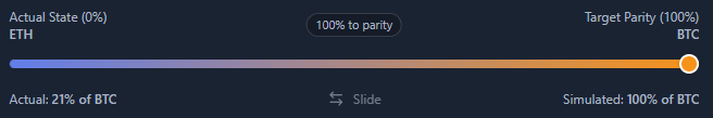
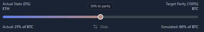
Example:
- ETH currently has ~21% of BTC’s market cap
- Full parity = 100% of BTC’s market cap
- Moving the slider to 50% to parity means:
Halfway between 21% and 100%
→ ~60% of BTC’s market cap
This is also shown on the bottom right of the slider UI.
This avoids misleading results and keeps the simulation anchored in reality.
Why this matters
If the simulator forced a fixed percentage of the target market cap:
- Historical comparisons would be distorted
- Assets that started near parity would be misrepresented
- Diverging market caps would produce artificial jumps
By simulating movement along the parity path, the tool stays consistent across time and direction (smaller → larger or larger → smaller).
Path mode vs History mode
Path mode
Path mode answers:
“What would Asset A be worth if it moved X% closer to Asset B’s market cap today?”
- Uses current market caps
- Slider controls progress toward parity
- Best for scenario exploration and intuition-building
History mode
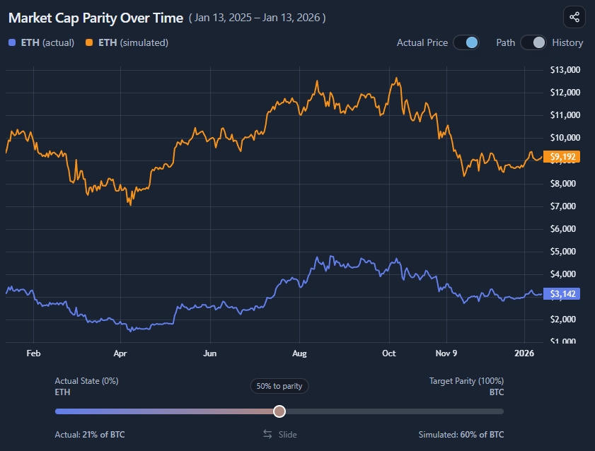
History mode answers:
“What would Asset A’s price have been over time if it had moved along this parity path?”
Key differences:
- Uses historical market caps of both assets
- Always calculates % to parity, not forced % of target
- Preserves divergence and convergence over time
This avoids skewed backtests when assets started near parity and later separated.
Actual vs simulated price
You can toggle the Actual Price series:
- On → Compare reality vs the simulated parity path
- Off → Focus purely on the implied valuation
This is useful when the actual price visually dominates the chart or distracts from the scenario.
What this is (and is not)
This tool is:
- A valuation thought experiment
- A way to reason about relative scale
- Useful for framing upside/downside narratives
It is not:
- A price prediction
- A probability model
- A timing signal
Common misinterpretations
- “50% to parity means 50% of BTC’s market cap”
→ ❌ No, it means halfway from current to target - “This shows where price will go”
→ ❌ It shows where price would be under a hypothetical condition - “History mode enforces parity retroactively”
→ ❌ It respects historical divergence and convergence
When this visualization is most useful
- Comparing relative upside across assets
- Stress-testing valuation narratives
- Explaining market cap intuition to others
- Understanding scale differences in bull/bear regimes
When not to use it
- For short-term trading decisions
- As a forecast or target price
- Without understanding current market cap context
Key takeaways
- Parity is a path, not a fixed percentage
- The slider represents movement toward parity, not absolute dominance
- History mode preserves realism across time
- This is a reasoning tool, not a prediction engine
How to use
Selecting assets
You can:
- Choose the simulated asset (Asset A)
- Choose the target asset (Asset B)
- Switch direction freely (smaller → larger or larger → smaller)
The simulator works symmetrically in both directions.
Using the parity slider
The slider controls:
- 0% → current market cap relationship
- 100% → full parity with the target
- Any value in between → proportional movement along the path
Read the slider as:
“How far toward parity should Asset A move?”
Not as:
“What percentage of the target market cap should Asset A have?”
Switching between Path and History
Use Path mode when:
- Exploring current scenarios
- Comparing implied prices today
- Thinking in static valuation terms
Use History mode when:
- Exploring how parity would have played out over time
- Avoiding distorted historical assumptions
- Comparing divergence dynamics
Reading the results panel
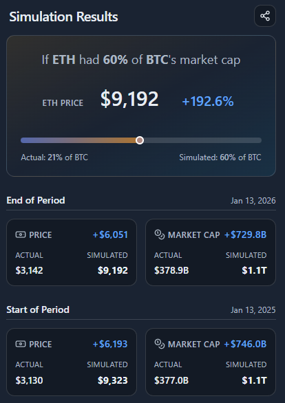
The results panel summarizes:
- Simulated price vs actual price
- Simulated market cap vs actual market cap
- Absolute and percentage differences
- Start vs end of period (in History mode)
This is where you translate the visual scenario into concrete numbers.
Example workflow
A typical use case:
- Select ETH as the simulated asset
- Select BTC as the target asset
- Start in Path mode
- Move the slider to 50% to parity
- Observe the implied ETH price
- Switch to History mode
- Compare how ETH diverged from that parity path over time
This quickly reveals how much of a valuation narrative is scale-driven versus market-driven.
