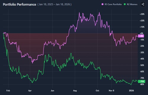
Interpretation
What problem this visualization solves
Comparing portfolios by absolute value is misleading.
A portfolio that starts with more capital will almost always look “better” in raw dollar terms, even if its allocation decisions were worse. Similarly, comparing a real portfolio against a model allocation is difficult when their starting values differ.
Portfolio Comparison removes this distortion by normalizing every portfolio to the same starting point.
What you’re looking at

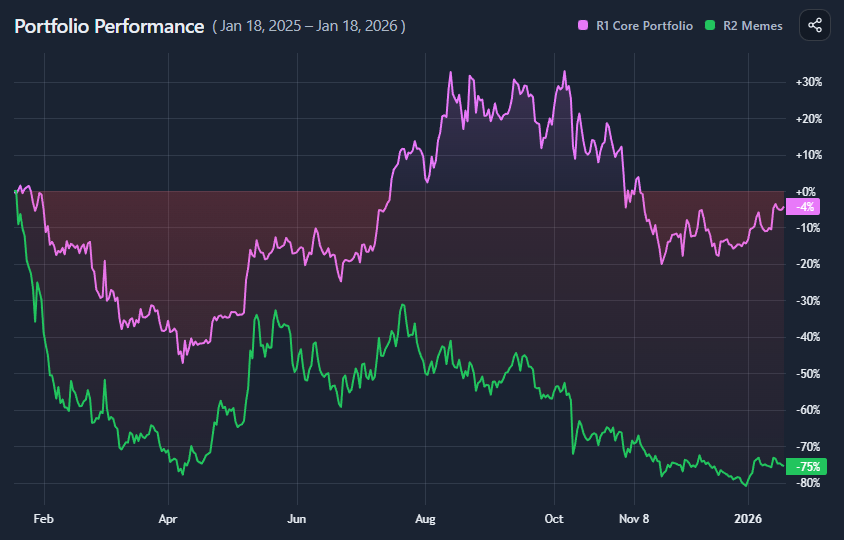
You are looking at an indexed performance chart for portfolios.
Each portfolio is rebased to 100 at the selected start date. From that point on, the chart shows relative returns, not absolute value.
This allows you to compare:
- Real portfolios built from positions (quantity × price)
- Model portfolios defined by weights (e.g. 80% BTC / 20% ETH)
- Any combination of the two, on equal footing
How to read the indexed chart
- All portfolios start at 100
- Upward movement means relative gains
- Downward movement means relative losses
- Distance between lines shows outperformance or underperformance
If one portfolio ends at 120 and another at 90, the first outperformed by 30 percentage points over the period, regardless of starting capital.
Relative performance vs absolute performance
This tool is about relative performance, not wealth.
It answers questions like:
- Which portfolio allocation worked better?
- Who suffered deeper drawdowns?
- When did leadership change?
- Was outperformance persistent or brief?
It does not answer:
- How much money you made in dollars
- Whether the position sizes were appropriate
- Whether the portfolio fits your risk tolerance
Those belong in absolute-value views.
Drawdowns and path dependency
Two portfolios can finish with similar end returns but behave very differently along the way.
This chart makes that visible:
- Depth of drawdowns
- Speed of recoveries
- Volatility of the return path
These differences matter because portfolios are lived through, not just measured at the end.
Outperformance is time-dependent
Outperformance is not a single number.
The same portfolio may:
- Underperform early
- Lead mid-cycle
- Give back gains later
The outperformance spread shown in the insights panel highlights:
- When the gap between portfolios was widest
- Whether leadership was stable or fragile
- Whether final outperformance came early or late
Model portfolios vs real portfolios

Model portfolios are clean and idealized.
Real portfolios are messy and constrained.
Comparing them directly helps answer:
- How much did execution and timing matter?
- Did active decisions improve outcomes or hurt them?
- How close did the real portfolio track the intended allocation?
This comparison is often more informative than comparing either in isolation.
Common misinterpretations
- Higher volatility does not mean higher skill
- A higher peak does not guarantee a better experience
- Short-term outperformance often reverses
- A smoother path can be preferable even with lower returns
This tool shows performance. Interpretation still matters.
When this visualization is most useful
- Comparing allocation strategies
- Evaluating active vs passive decisions
- Benchmarking a portfolio against a model
- Studying drawdown behavior
- Understanding relative risk-taking
When not to use it
- For absolute P&L analysis
- For position sizing decisions
- For short-term trading signals
- Without context on risk and volatility
Key takeaways
- Indexed comparison removes starting-value bias
- Relative performance is about allocation, not capital size
- Drawdowns and path matter as much as final return
- Outperformance is time-dependent, not constant
- Model portfolios are benchmarks, not guarantees
How to use
Selecting portfolios
You can compare two portfolios by selecting:
- A real portfolio built from holdings
- A model portfolio built from weights
- Any combination of the two
Both are treated identically once selected.
Choosing the date range
- Select a custom start and end date, or
- Use quick ranges like “Last 365 days”
The start date is where normalization happens. Changing it can materially change conclusions.
Reading the insights panel

For each portfolio, the panel shows:
- Final indexed performance
- Best and worst points (with dates)
- Drawdown extremes
The outperformance section summarizes:
- Maximum spread between portfolios
- Final relative winner
Example workflow
A simple way to use the tool:
- Compare a real portfolio against a model allocation
- Identify when they diverged
- Check whether outperformance was persistent
- Observe drawdowns and recovery speed
- Decide whether differences came from allocation or timing
This turns performance into insight rather than hindsight.
